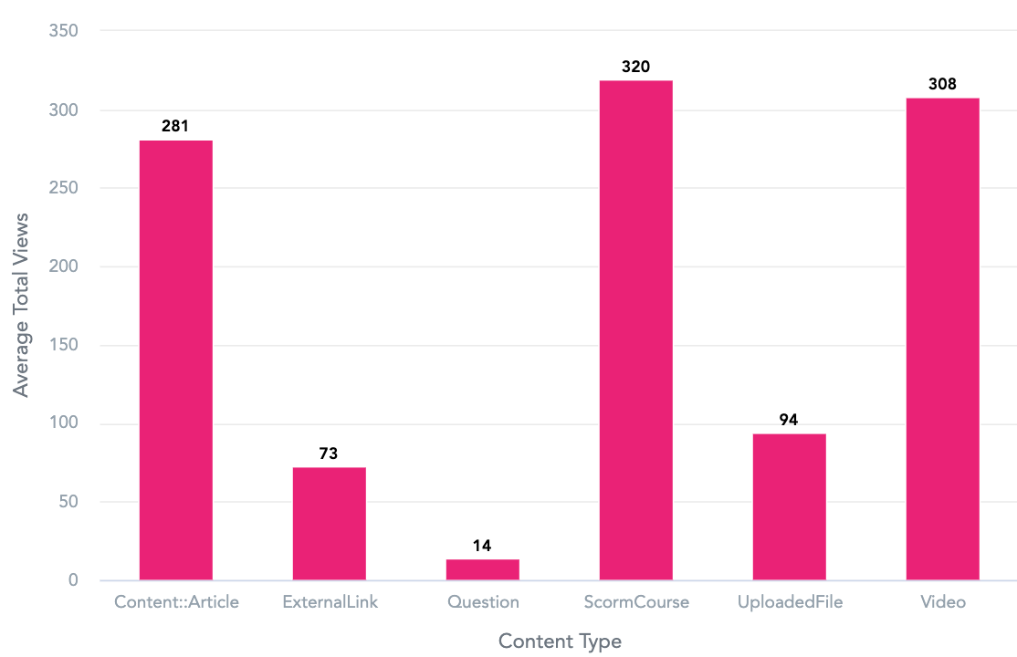
Your selected metrics, facts and attributes are visualised in your chosen chart, graph or table.
In the example below, the selected data is visualised as a column chart, showing the average number of content views per content type in Fuse.

Your selected metrics, facts and attributes are visualised in your chosen chart, graph or table.
In the example below, the selected data is visualised as a column chart, showing the average number of content views per content type in Fuse.