
Click the Table icon to visualise your data as a table. Tables are typically used to create custom reports or to rank data.
Examples
Below are some examples of tables you might create.
Custom reports
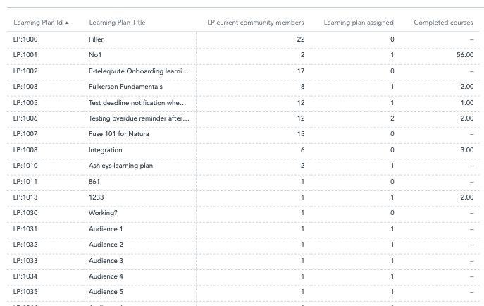
You can use a table to create custom reports. In the example below, this custom report contains a lists all learning plans that exist in Fuse (Including the ID and title of each one), the number of community members assigned to each one, and the total completion.
A report can contain a maximum of 60,000 rows of data.
To recreate this example:
-
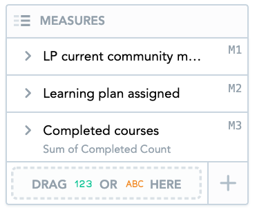
Drag Learning Plan Current Community Members, Learning plan assigned, and Completed Courses from the Data Catalogue, into the Metrics section. You can stack multiple metrics in the Metrics section if you want to display multiple metrics on the table.
-
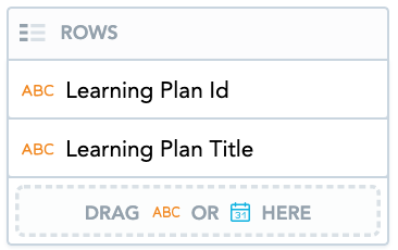
Drag Learning Plan Id and Learning Plan Title from the Data Catalogue, into the Rows section to add further detail.
-
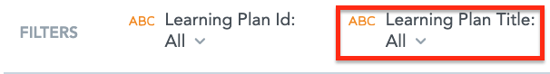
Drag the Learning Plan Id attribute from the Data Catalogue, into the Filters section, so that the IDs of all learning plans are included in the report.

-
Drag Learning Plan Title from the Data Catalogue, into the Filters section, so that the titles of all learning plans are included in the report.
You can stack multiple attributes in the Column and Row sections.
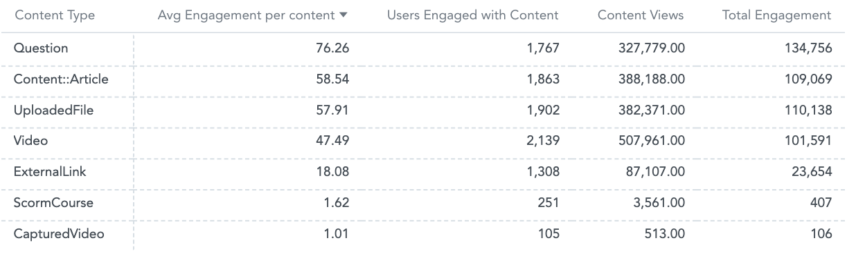
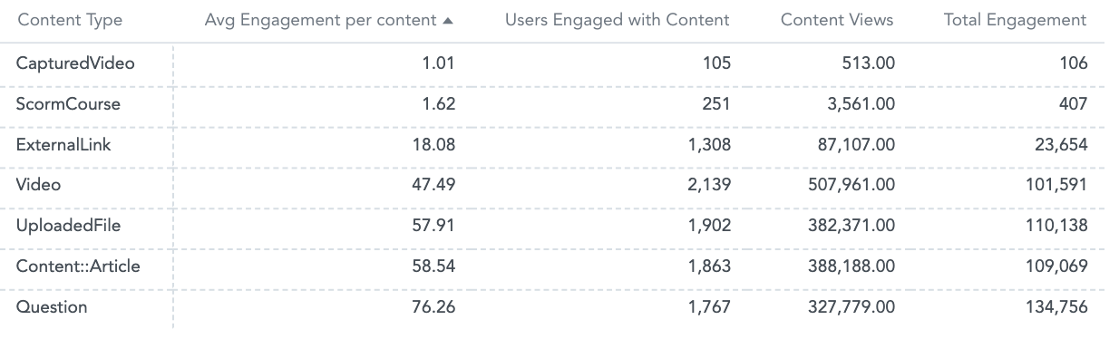
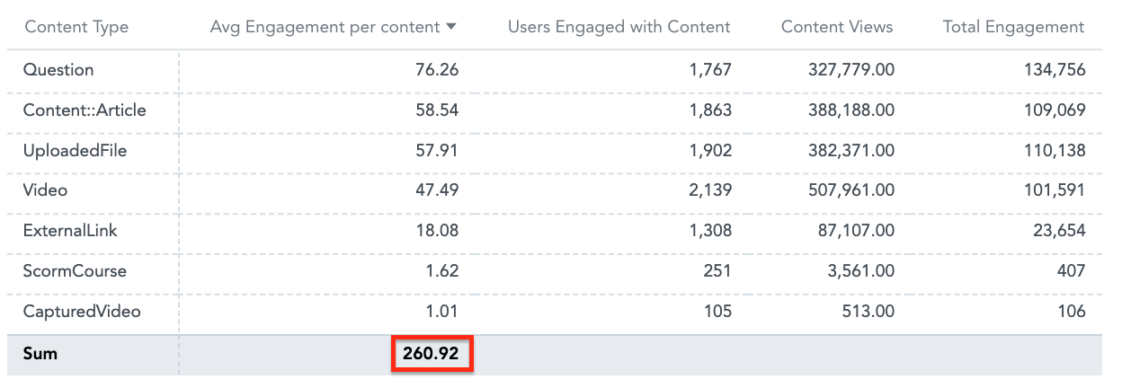
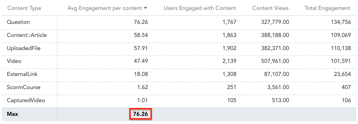
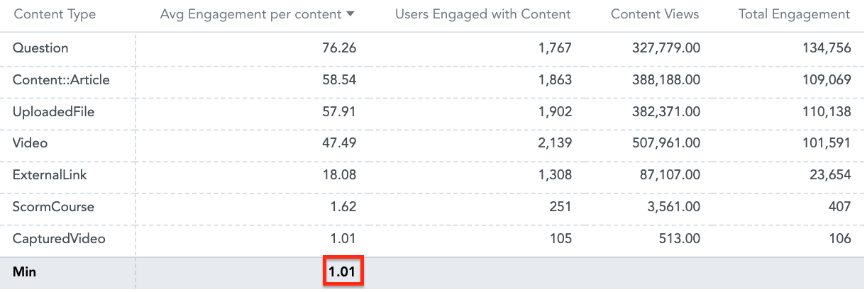
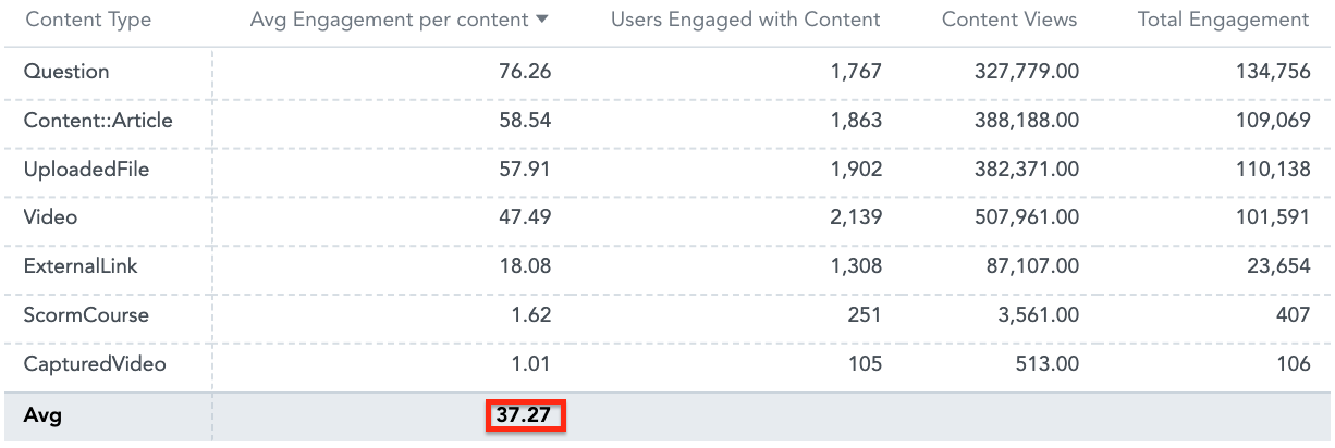
Rank data
A table can be used to rank data. In the example below, this table lists all the content types in Fuse and ranks them based on their popularity, with the most popular content type at the top of the list and the least popular at the bottom.
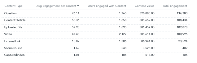
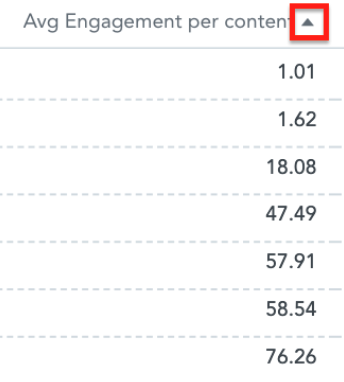
Once you have data to a table, you can rank it by changing the order in which it is listed. You can change the order of the data so that it is displayed in ascending or descending order, by clicking the arrow at the top of each column.
-
Clicking the downward arrow at the top of a column, ranks the data in ascending order.
-
Clicking the upward arrow at the top of a column, ranks the data in descending order.
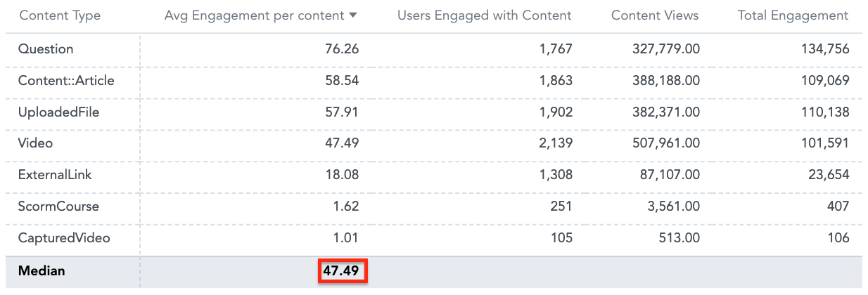
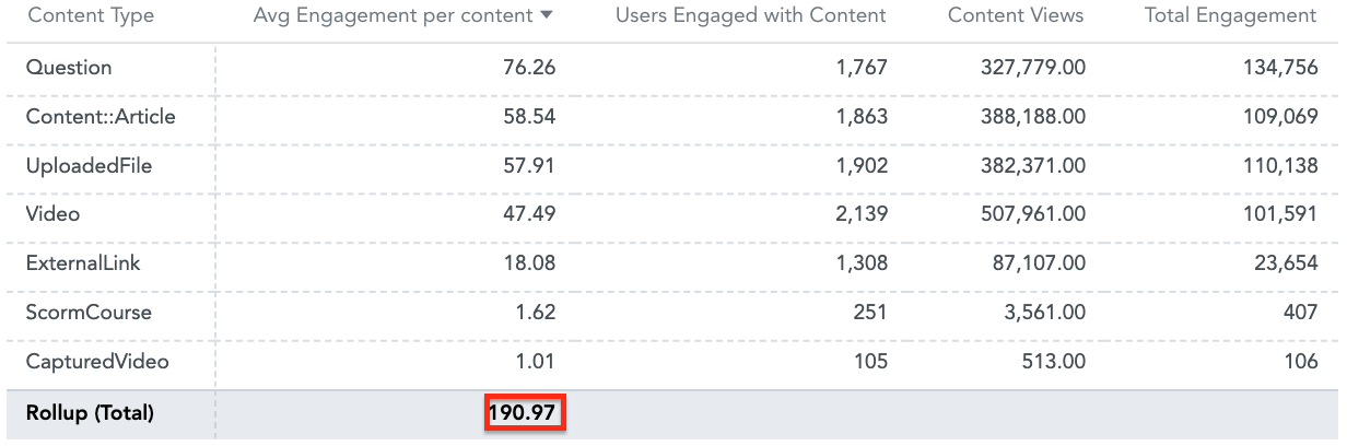
You can also perform additional calculations on the metrics in your table, by hovering over each column header and clicking the hamburger menu.
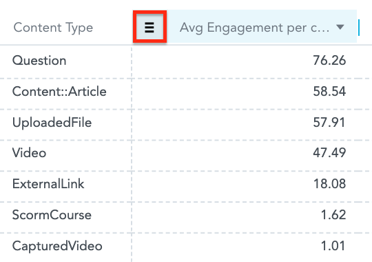
You can choose from the following options:
-
Sum: Add all the values in a column together to get a total.
-
Max: Find the maximum (largest) value of all the data in a particular column.
-
Min: Find the minimum (smallest) value of all the data in a particular column.
-
Avg: Find the average of all the data in a particular column.
-
Median: Find the median (middle value) out all the data in a particular column.
-
Rollup: Find the rollup total for all the data in a particular column.
To recreate this example:
-
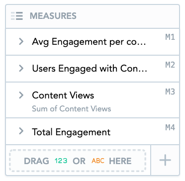
Drag the Avg Engagement Per User, Users Engaged with Content, Content Views, and Total Engagement from the Data Catalogue, into the Metrics section.
-
Drag Content Type from the Data Catalogue, into the Rows section.