This section explains how various features of Fuse make knowledge more accessible.
Knowledge Intelligence (KI) engine
Videos, articles, PDFs and Microsoft Office content items created in or uploaded to Fuse go through the Knowledge Intelligence engine. This engine produces a text transcript by extracting knowledge whether text or audio. This transcript is indexed in the search engine, making the knowledge within the content more accessible. The search results page also displays a snippet from content transcripts as part of the search results to demonstrate the relevancy of the content to the user.
Creating accessible content
Web Content Accessibility Guidelines (WCAG) 2.1 may look complicated, but the essence of the message is simple: digital content should be easy to perceive, understand and operate for everyone. The guidelines define the different ways content creators can support employees with different needs.
When designing accessible learning, you should look at:
-
Images
-
Text size and customisation
-
Headings
-
Lists
-
Links
-
Alternatives to video
-
HTML
-
UI Design
-
JavaScript in SCORM
Images require alternative text
Some of your employees may use screen readers to convert the text on the screen to audible speech or to braille. Screen readers cannot interpret images, which is why the HTML code for images includes the option to add ‘alternative text’ or ‘ALT text’. This allows you to describe an image so that anyone using a screen reader can understand what the image includes.
Key considerations:
-
Informative images need informative ALT text, so that users do not miss vital details
-
Decorative images have null ALT text or are set as background images
-
Text should never be embedded within images
-
Links should never be embedded purely within decorative images
When adding an image to an article, there is the option to add ALT text, as shown below: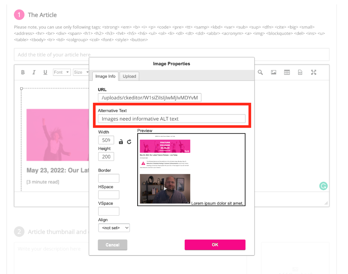
Text size should be customisable
Text can be a very personal thing. Some employees are happy to read small font sizes, but many other employees like to increase font sizes when reading on a screen. And for others, the contrast between the text colour and the background makes a big difference when reading text.
Key considerations:
-
Text should be resizable
-
Text must remain legible and visible when resized
-
Text should be at least 8pt in size
How do I check this?
The Fuse interface scales articles and native content when zooming, but custom CSS (Cascading Style Sheets) within articles and descriptions can affect this. This can also happen within custom widgets. To assess:
-
Change the zoom settings within your browser between 75% and 125% to check that text resizes correctly and remains visible
-
Within SCORM courses, ensure that you size your text boxes sufficiently to allow for text to be enlarged by the browser and still remain visible
Headings/titles must be clearly labelled
Many employees who use screen readers to skip around a page to see what it contains before deciding where to start. While a SCORM course is more likely to be consumed in a linear format, from start to finish, other content types such as articles enable employees to skip back and forth. This means that headings and subheadings are just as important for employees with accessibility needs. The appearance and inclusion of headings and subheadings is not the only consideration: headings must also be correctly labelled with HTML and properly nested. You can do this by ensuring that any headings are marked using H1, H2, H3… within the article editor.
Key considerations for articles, SCORM courses and PDFs:
-
Every page should have a heading marked as <h1> and sub-headings marked as <h2> (in the HTML code)
-
The first heading should clearly describe the contents of the page
-
Every page section should have its own heading
-
Headings should stand out from regular text (at least two points larger than regular text )
You can also ensure that this applies in topics and learning plans by titling content in a descriptive way e.g. rather than ‘Course PDF’ say ‘An introduction to this Leadership in Action course’.
Lists – labelled accurately and clearly
Labelling lists is important for clarity - and it’s just good practice in general web design terms.
Key considerations:
-
Lists must be labelled as either ordered (numbered) or unordered (bullet points)
-
Lists should not be broken up or interrupted by other content
Links should tell employees about the destination
Do all of your links explain what happens when it’s clicked? Generic text in links, such as ‘more information’ or ‘click here’ should be avoided – and replaced with clear information like ‘Creating Accessible Content – read more’.
Key considerations:
-
Links should make sense out of context
-
Avoid using the same text for a series of links (e.g. ‘Next page’ or ‘Click here’)
-
Link text should be front-loaded so the most important keywords are at the start of the link text
-
Links should stand out visually
-
employees should be informed when links open a new window
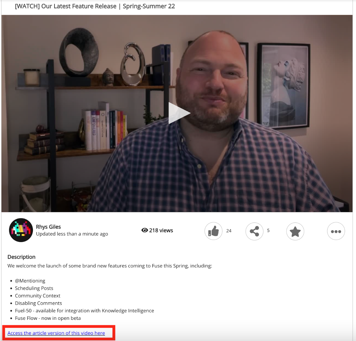
Alternatives to video
Whilst video is the most engaging format, it is important to consider alternative ways of accessing the same knowledge within the video for those who are visually impaired
Key considerations:
-
Ensure the transcript is available (this also enables screen readers to access the transcript)
-
Make an alternative format (e.g. article, podcast) available. These can be made available via links in the video description. This also ensures that learning plan completions are not affected by adding additional items into topics.