The Surveys section in the Surveys tab, shows insights related to published surveys and user response rates. This includes a bar chart showing how many users are starting surveys vs completing them on a monthly basis, from across the Fuse instance. This data can be very useful, as it gives you an indication of how well received surveys are. For example, if users are starting surveys but not completing them, you could try improving the questions in the surveys to make them more engaging or relevant.
The following insights are shown:
|
Insight |
Description |
|---|---|
|
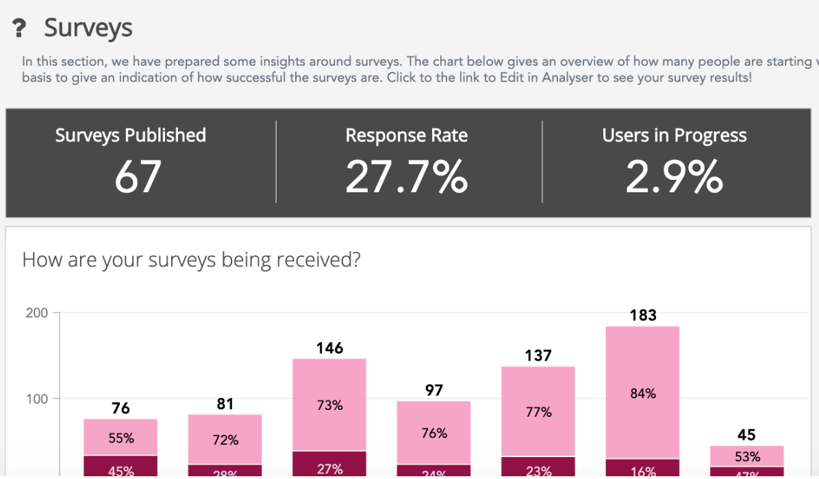
Surveys Published |
The total number of published surveys in the Fuse instance, based on filters selected in the Filter By section. In the example below, 67 surveys have been published in Fuse. 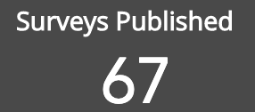
|
|
Response Rate |
The percentage of users who have completed surveys. In the example below, 27.7% of users in the instance have completed surveys. This shows that less than half of all users have responded to surveys published in Fuse. If users are not taking surveys, you could try improving the questions in the surveys to make them more engaging or relevant. 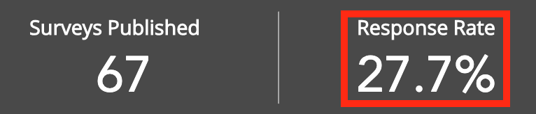
|
|
Users in Progress |
Users who have started surveys but have not yet completed them. In the example below, 2.9% of users in the Fuse instance have started surveys but have not yet finished them. 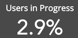
|
|
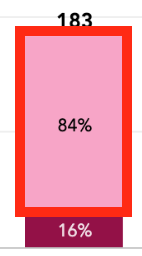
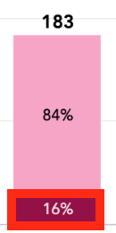
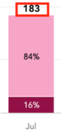
How are your surveys being received? |
A bar chart showing the number of users who have started surveys vs completed them on a monthly basis. This gives you an indication of how well received the surveys created in Fuse are. 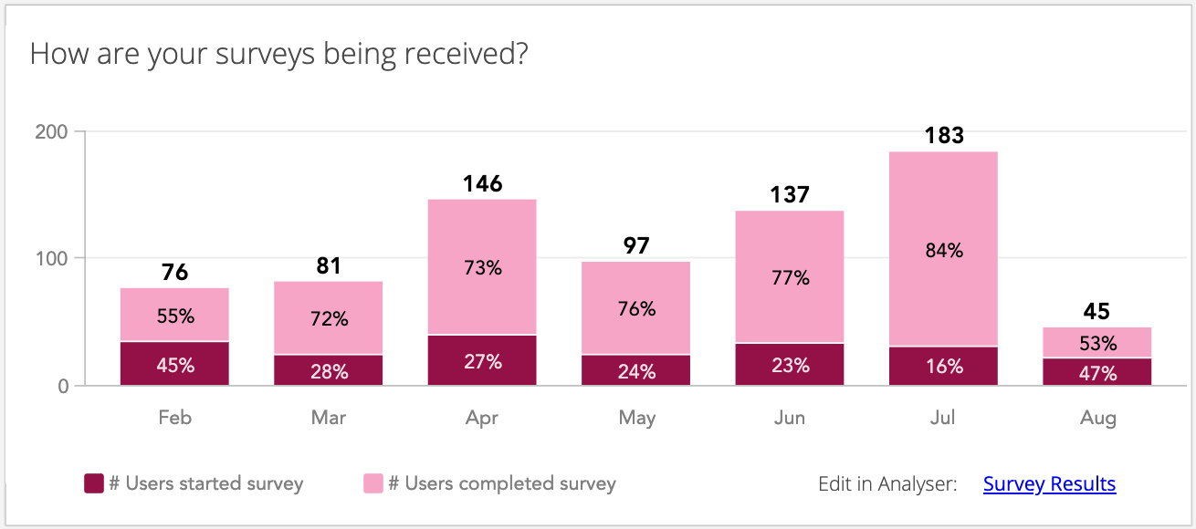
If a higher number of users are starting surveys but not completing them, you could try to improve the subject matter or questions. For example, your users might prefer free text questions in which they can give more detailed and personalised answers, instead of a series of multiple choice questions. Each bar on the chart is divided into two portions:
Hover over each section on each individual a bar, to reveal the details. In the example below, 153 users (84% of users) completed surveys in July. 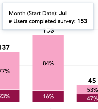
In the example below, July has the highest number of users who have completed surveys. 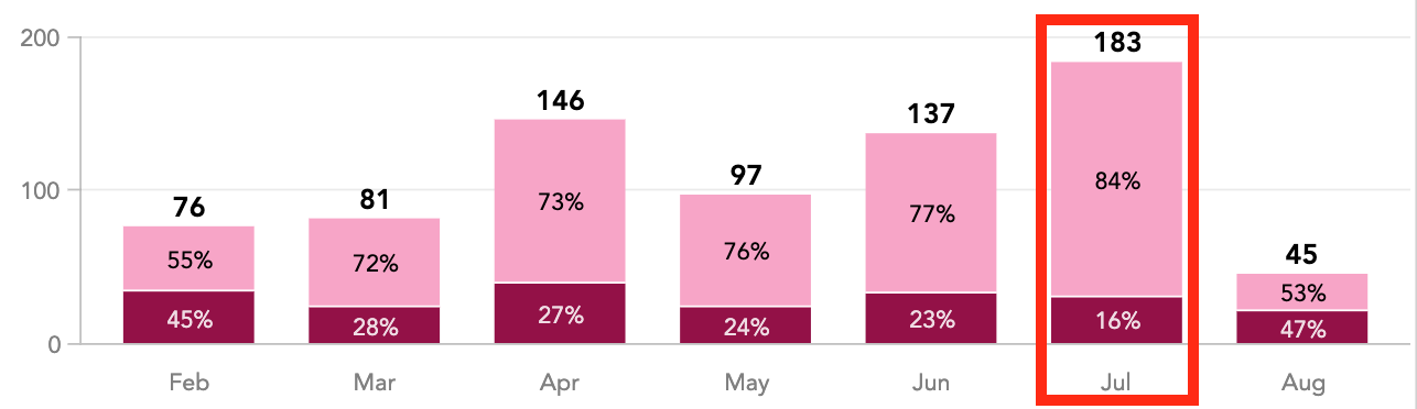
Hover over each colour on the legend to isolate that information on the bar chart. 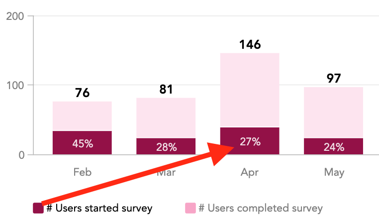
|