
Click the Bubble chart icon to visualise your data as a bubble chart. A Bubble chart is essentially the same as a scatter plot, in that you can take two metrics (One on the Y-Axis and one on the X-Axis) and see if there is a relationship between them. However, unlike Scatter plots, the Bubble chart features an extra metric called Metric (Size) which determines the size of each bubble on the chart.
Example
In the example below, this bubble chart plot is being used to show if there is a relationship between the number of questions in an assessment and the number of users completing an assessment, and whether or not this affects the pass rate.
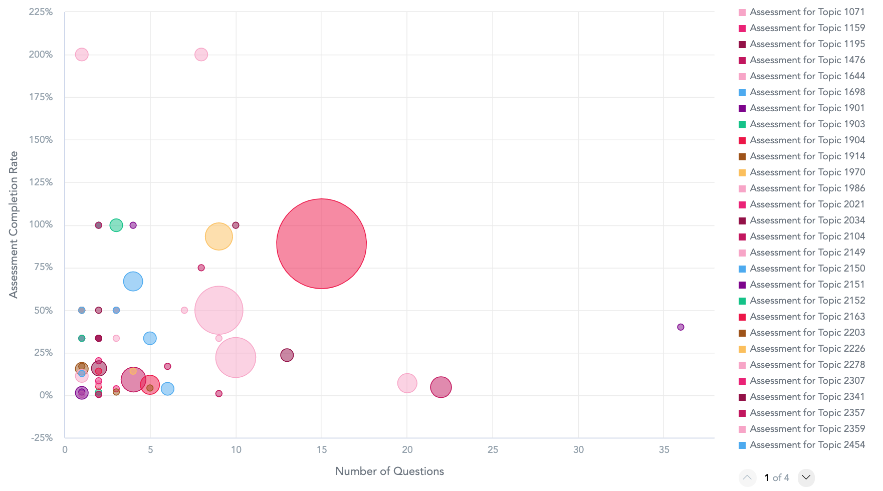
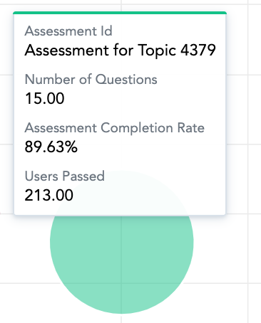
Hovering over each bubble on the chart reveals details, such as the assessment ID, the number of questions in the assessment, assessment completion rate, and the number of users who have passed the assessment.
To recreate this example:
-
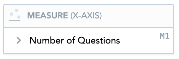
Drag Number of Questions in Assessment from the Data Catalogue, into the Metric (X-axis) section. This section displays a metric on the X-axis of the scatter plot.
-
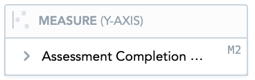
Drag Assessment Completion Rate from the Data Catalogue, into the Metric (Y-axis) section. This section displays a metric on the Y-axis of the scatter plot.
-
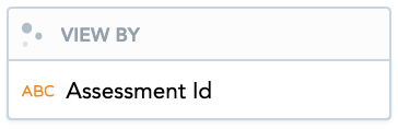
Drag Assessment Id from the Data Catalogue, into the View By section. This section is used to display an attribute. This attribute determines the meaning of each point in the scatter plot.
-
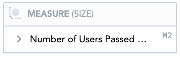
Drag Number of Users Passed the Assessment into the Metric (Size) section. This section is used to determine the size of each bubble on the chart. If a bubble on the chart is larger, it means there is a higher number of users passing the assessment and if the bubble is smaller, less users are passing.
-
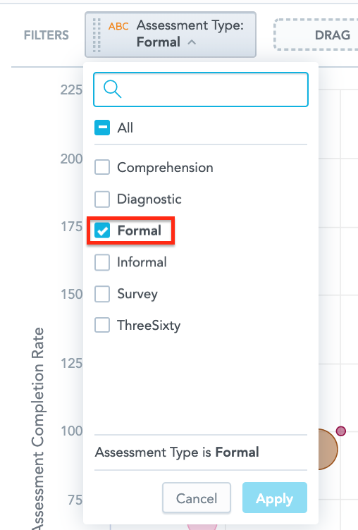
Drag the Assessment Type attribute from the Data Catalogue, into the Filters section above the chart.
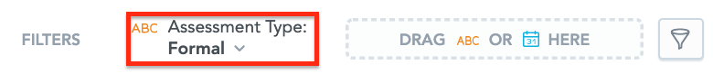
From the dropdown, select Formal, so that the bubble chart only shows formal assessments.
Additional features
The Bubble chart also allows you to:
Apply filters
You filter the data in the chart, in the Filters section.
Customise the look and feel
You can customise the look and feel of the chart to match your organisation's branding. For more information about customisation, see the Configuration section.