
Click the Stacked Area chart icon to visualise your data as a stacked area chart. A stacked area chart allows you to identify and compare trends in multiple metrics using multiple line charts stacked on top of each other.
Stacked area charts show multiple lines showing showing something different, whereas stack area charts show can show one or multiple lines each showing the same
Examples
Compare two different metrics.
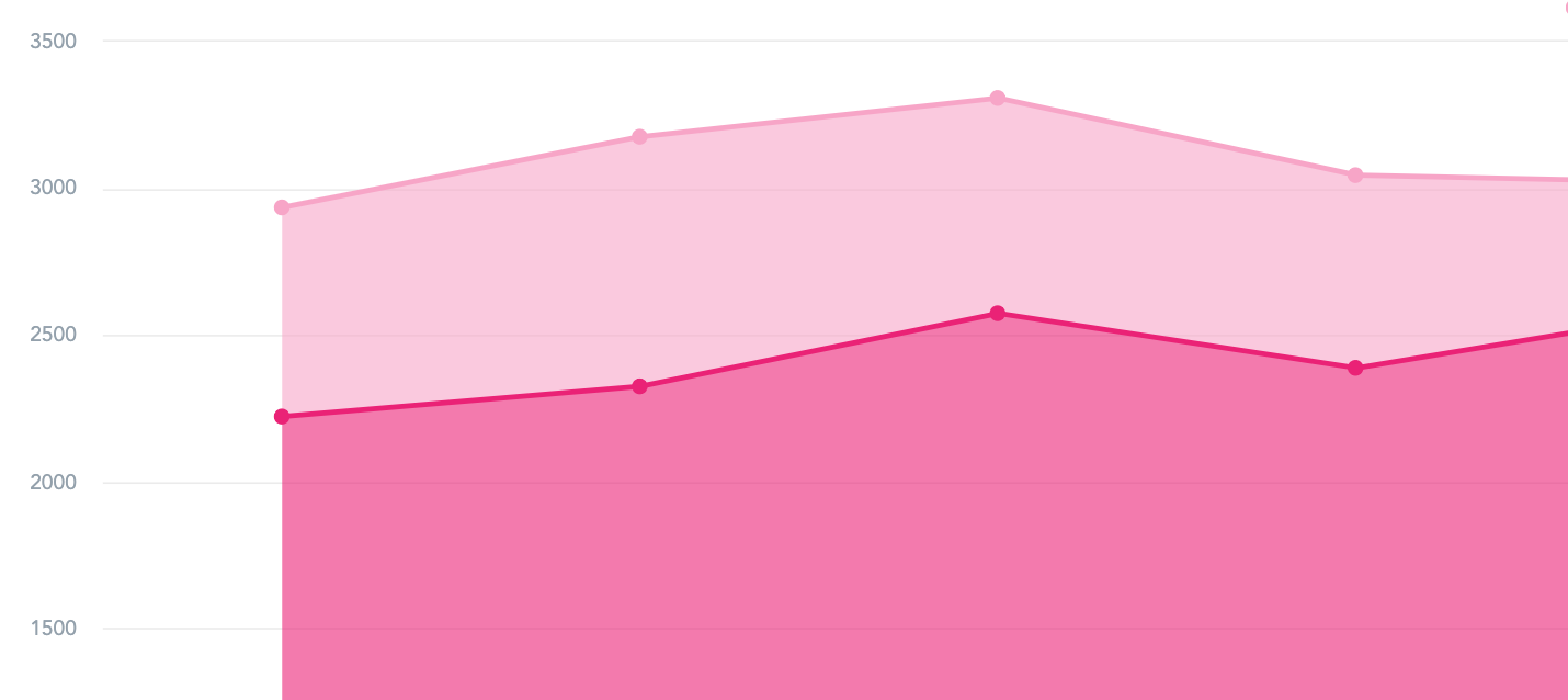
You might use the stacked area chart to compare two different metrics. For example, how many users were active vs inactive in Fuse over the last 6 months.
To recreate this example:
-
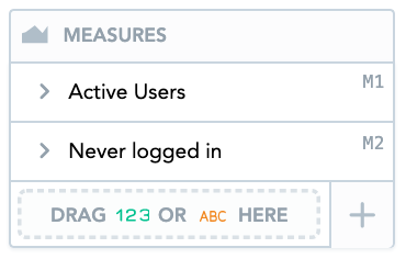
Drag Active Users and Never logged In from the Data Catalogue, into the Metrics section.
-
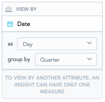
Drag Date from the Data Catalogue, into the View By section. From the as dropdown, select Day. From the group by dropdown, select Quarter.
-
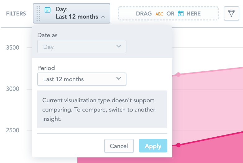
Drag Date from the Data Catalogue, into the Filters section.

-
Select Last 12 Months from the Period dropdown.
Compare different categories
You might use a stacked area chart to compare different categories. For example, the relative difference between percentage of views for each content type over a specific period of time.
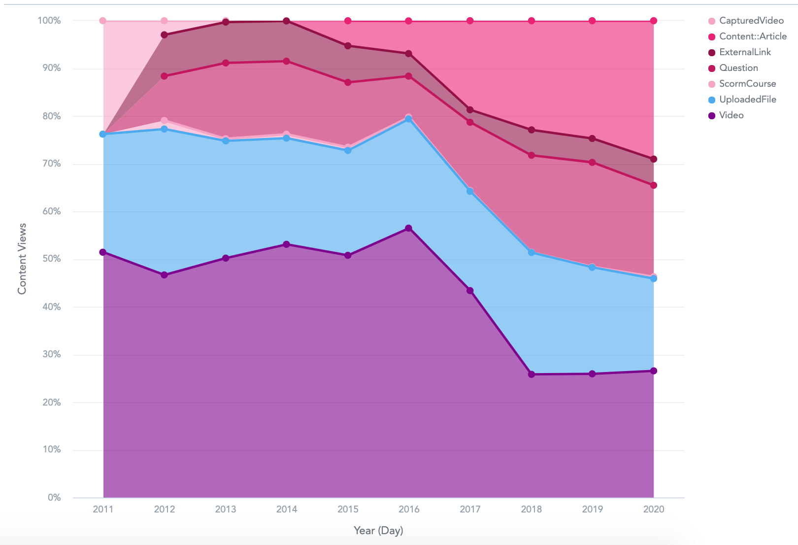
To recreate this example:
-
Drag Content Views from the Data Catalogue, into the Metrics section.
-
Drag Date from the Data Catalogue, into the View by section. From the as dropdown, select Day. From the group by dropdown, select Year.
-
Drag Content Type from the Data Catalogue, into the Stack By section. This allows you to stack each content type on top of each other, so that you can compare the content views for each one.
Additional features
The Stacked Area chart also allows you to:
Apply filters
You filter the data in the chart, in the Filters section.

Customise the look and feel
You can customise the look and feel of the chart to match your organisation's branding. For more information on customising insights, see the Configuration section.