Click the Headline icon to display your data as a headline chart. A headline chart allows you to display a single metric or show a comparison between two different metrics.
You cannot customise the look and feel of Headline charts.
Example
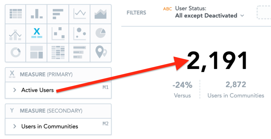
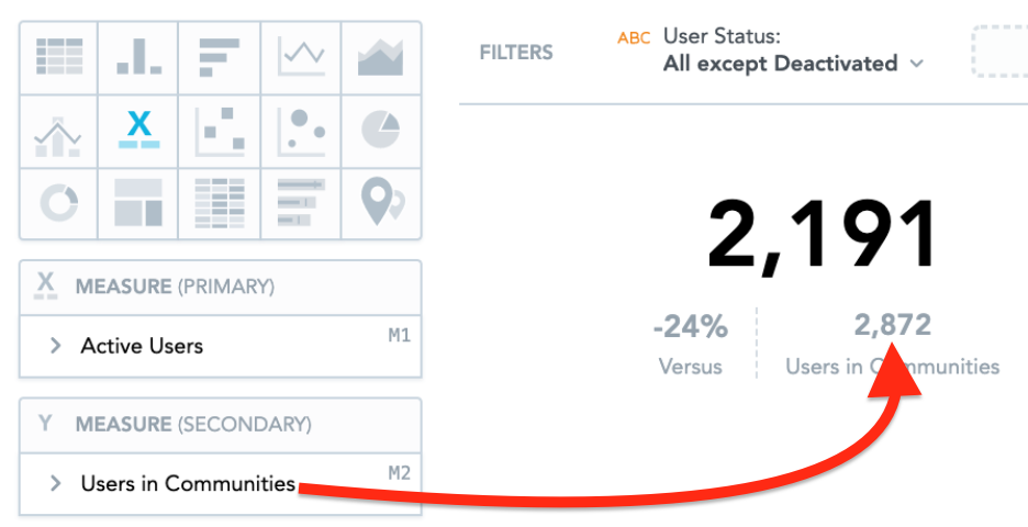
In the example below, this headline chart shows the number of active users out of all users assigned to a community.
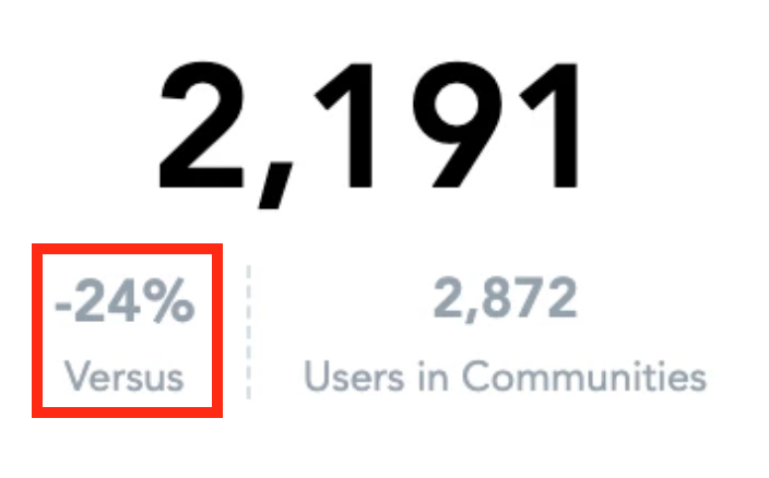
There are 2,191 active users out of a total of 2,872 users assigned to a community.
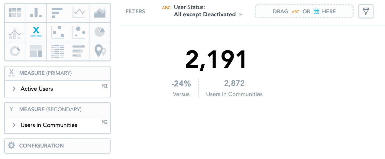
If you are comparing two metrics, you will also see the change between them as a percentage, in the Versus section. In the example below, the number of active users assigned to communities has decreased by 24%.
To recreate this example:
-
Drag Active Users from the Data Catalogue, into the Metric (Primary) section.
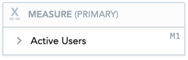
This displays the total number of active users in the main headline.
-
Drag Users in Communities from the Data Catalogue, into the Metric (Secondary) section.
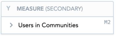
This displays the total number of users assigned to a community as the secondary metric underneath the main headline.
-
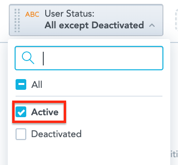
Drag User Status into the Filters section.

From the dropdown, select Active, so that only active users are included.