
Click the Bar chart icon to visualise your data as a bar chart. Bar charts can be used to make comparisons.
Example
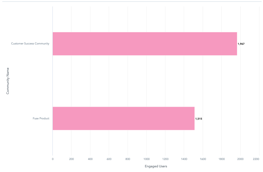
In the example below, this bar chart compares the number of engaged users in two different communities.
To recreate this example:
-
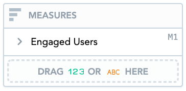
Drag Engaged Users (trend) from the Data Catalogue, into the Metrics section.
-
Drag Community Name from the Data Catalogue, into the View By section.
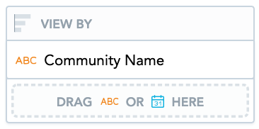
You can only add Date or attributes to the View by section.
-
Drag Community Name from the Data Catalogue, into the Filters section. Then select the checkboxes for communities you want to compare. In the example below, we have selected two communities, however, you might want to compare more.
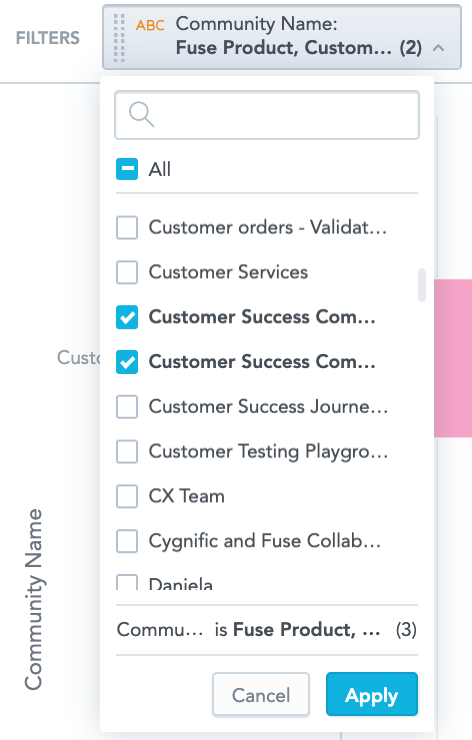
All checkboxes are selected by default when dragging in an attribute or date. You can deselect checkboxes to exclude data if required.
Additional features
The bar chart also allows you to:
Create stacked bar charts
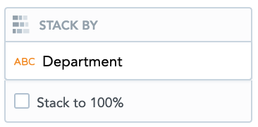
You can create a stacked bar chart by dragging attributes into the Stack By section. A stacked bar chart can add more depth to your insight by further breaking down the data.
For example, you might want to see the number of engaged users in the selected communities, broken down by department. To do this, you could drag the Department attribute into the Stack By section.
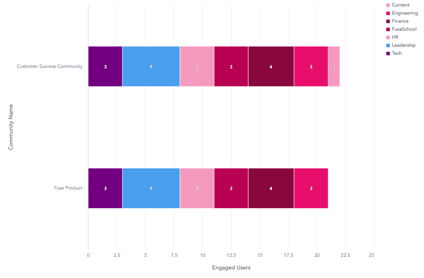
This divides each bar into sections, with each section representing a different department. Hovering over each section, reveals the number of engaged users for a particular department.
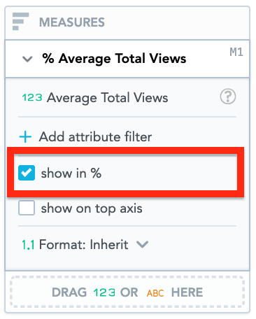
Display data as a percentage
You can display the data in the Metrics section as a percentage on the bar chart, by selecting the Show in % checkbox. This will show you the relative differences in your metric of interest, across the attribute you have selected (For the example above, it would show you the percentage of engaged users across departments in a specific community).
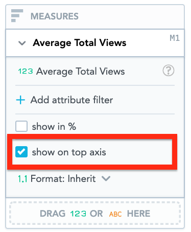
Move the Y-Axis
You can display the Y-axis to the right of the bar chart, by selecting the show on right axis checkbox.
Customise the look and feel
You can customise the look and feel of the chart to match your organisation's branding. For more information about customisation, see the Configuration section.