
The User insights section in the Overview tab, shows insights related to license and site usage, over the period defined in the TIME PERIOD filter.
At present, it is not possible to distinguish between activity coming from the Fuse mobile app and Fuse desktop.
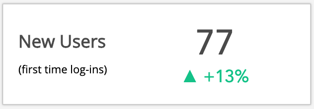
All trend indicators are based on 30 day periods. In the example below, the number of new users logging in to Fuse for the first time, has increased by 13% when compared to the same time 30 days prior.
The following insights are shown:
|
Insight |
Description |
|---|---|
|
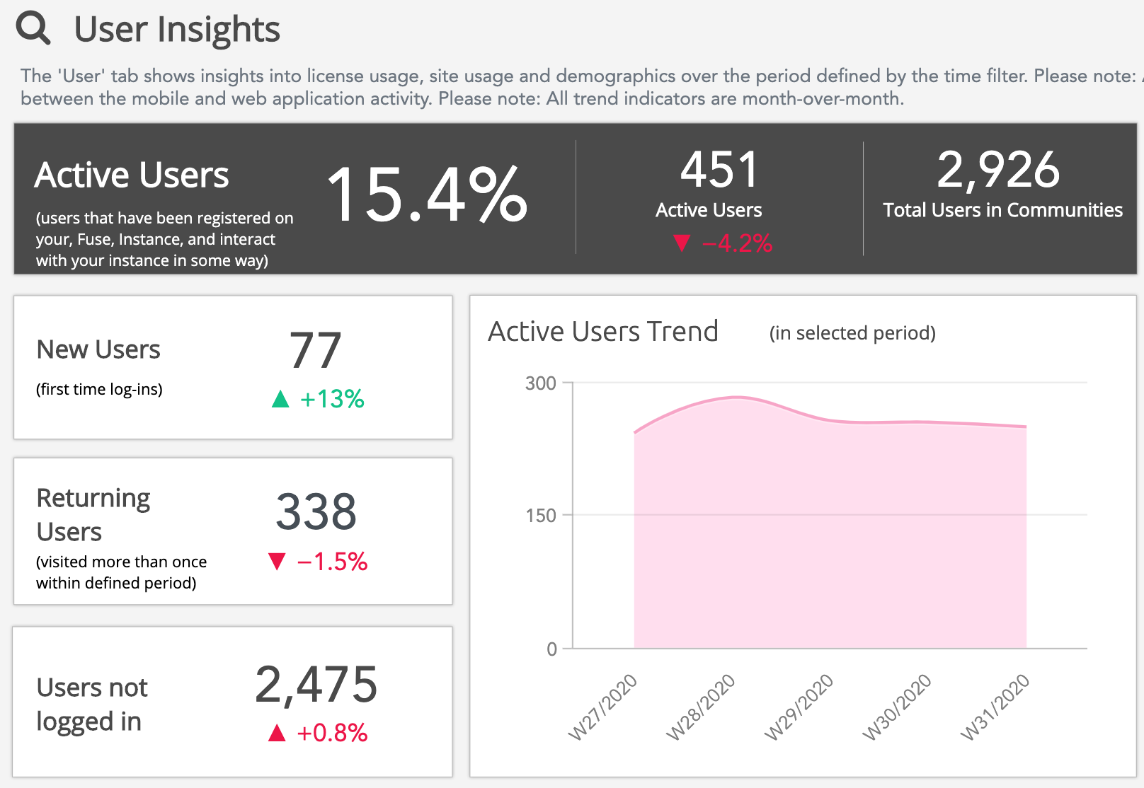
Active Users |
Shows a breakdown of users in the Fuse instance who are currently active in some way (for example by engaging with or searching for content) over the period defined in the TIME PERIOD filter, including upward and downward trends. Active users and engaged users are distinctly different.
An active user can become an engaged user if they interact with an item of content in one of the ways listed above. Active users can only be measured on a site wide level. If you want to understand active usage of communities, we recommend using the Engaged Users section in the Engaged Users Overview tab. 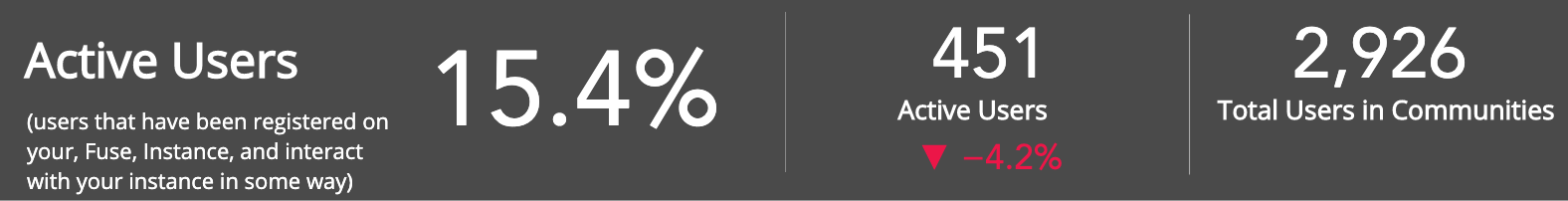
You can see the percentage of users (who are members of one or more communities) who are currently active. This can help you see how many users have actually logged into the Fuse instance out of all users who have access. In the example below, 15.4% of users have logged into the Fuse instance. 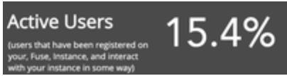
You can also see if this number has increased or decreased, when compared to the same time 30 days prior. In the example below, the number of active users has decreased by 4.2% when compared to 30 days prior. This means there are 19 fewer active users when compared to the same time 30 days before. 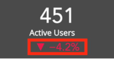
You can also see the total number of active users across communities in the Fuse instance. In the example below, the total number of active users across all communities is 2,926. 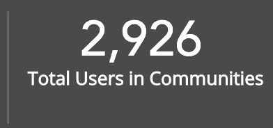
|
|
New Users |
Shows the number of new users that have logged into Fuse for the first time, over the period defined in the TIME PERIOD filter, as well as upward and downward trends when compared to the same time 30 days prior. This is particularly useful when looking at user adoption of Fuse.
In the example below, 77 new users have logged into the Fuse instance. 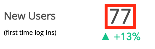
You can see the upward/downward trend. In the example below, the number of new users logging in to Fuse for the first time has increased by 13% when compared to the same time 30 days prior. This means 10 new users have logged in, when compared to the same time 30 days before. 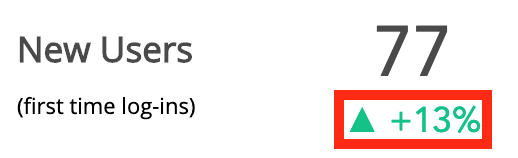
|
|
Returning Users |
Shows the number of users who have visited the Fuse instance more than once, over the period defined in the TIME PERIOD filter. You can also see how this number has increased/decreased when compared to the same time 30 days prior. This is particularly useful in finding out how many users continue to use Fuse. If there is a consistent downward trend in returning/active users, you might try to understand what prevents them from doing so and how you can feed that into your learning strategy. For example, you could send out a survey to gain insight into what your users would like to see. You could then try and make improvements, such as making content more relevant and appealing, or change certain page layouts so the most important and engaging content is easily visible. 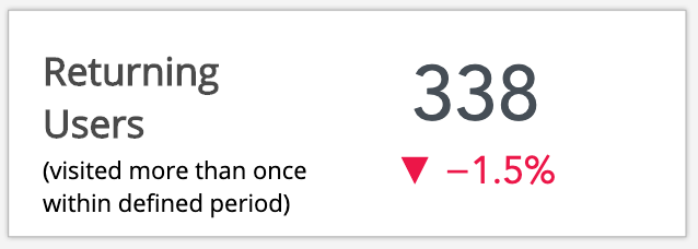
In the example below, 338 users visited the Fuse instance over the defined period. The number of returning users has decreased by 1.5% when compared to the same time 30 days prior. This means there are 5 fewer returning users when compared to the same time 30 days before. 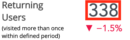
|
|
Users not logged in |
Shows the number of users who have not logged in/the number of users who have not used their licenses, over the period defined in the TIME PERIOD filter, as well as upward and downward trends when compared to the same time 30 days prior. If you find that there is an upward trend in users not logging in, you might want to try and understand what prevents your users from logging in and using Fuse, as well as how you can feed that into your learning strategy. For example, you could send out a survey to gain insight into what your users would like to see. You could then try and make improvements, such as making content more relevant and appealing, or change certain page layouts so the most important and engaging content is easily visible. In the example below, 2,475 users have not logged in. 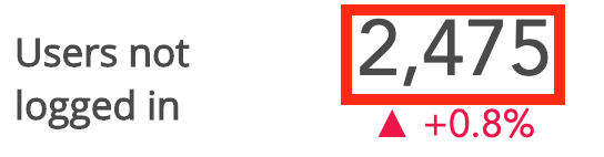
You can also see the upward/downward trend. In the example below, the number of users not logging in has increased by 0.8%, when compared to the same time 30 days prior. 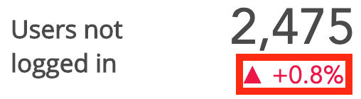
|
|
Active Users Trend |
The Active Users Trend graph shows the overall upward/downward trend in active users, over the period defined in the TIME PERIOD filter. 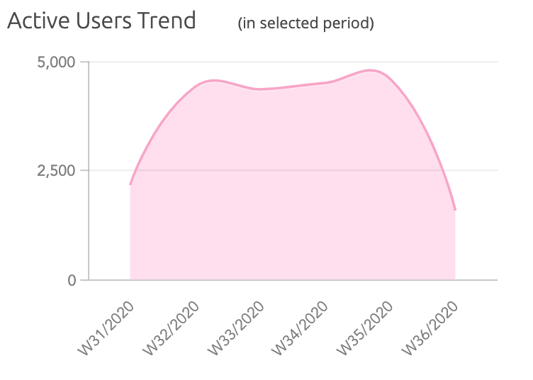
Hover over the line on the chart to view the details for each week. 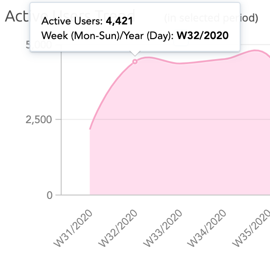
|