
Click the Pie chart icon to visualise your data as a pie chart. Pie charts allow you to make comparisons.
Example
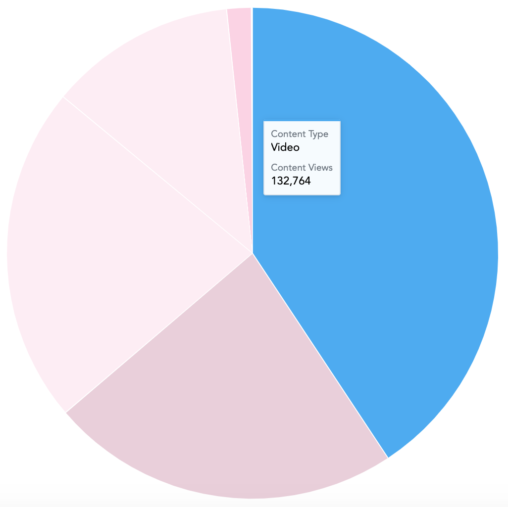
In the example below, this pie chart compares the popularity of the different content types in Fuse, based on how many times each type has been viewed.
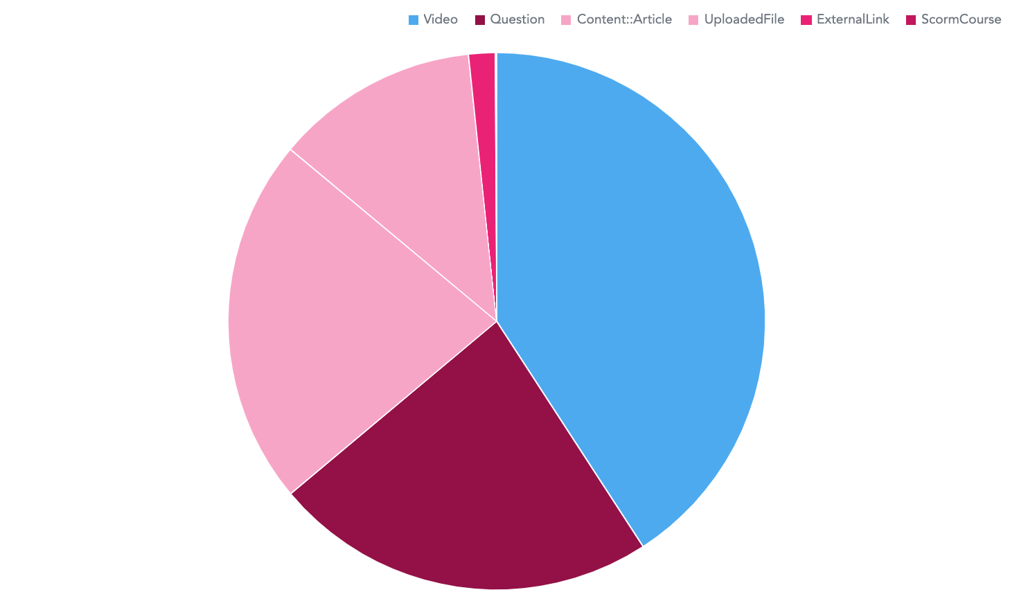
Hovering over each section on the pie chart reveals the number of views for a particular content type.
To recreate this example:
-
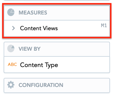
Drag Content Views from the Data Catalogue, into the Metrics section.
-
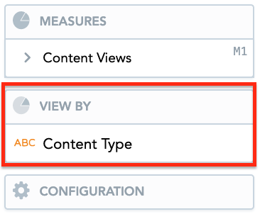
Drag Content Type from the Data Catalogue, into the View By section.
-
Drag the Community Name attribute into the Filters section above the pie chart, so that community views from all communities in Fuse are included.

Additional features
The Pie chart also allows you to:
Customise the look and feel
You can customise the look and feel of the chart to match your organisation's branding. For more information about customisation, see the Configuration section.