
Click the Treemap icon to visualise your data as a treemap. Treemaps allow you to rank data in a hierarchy, in the form of nested rectangles.

Example
In the example below, this treemap shows which team in Fuse has viewed the most learning plans, broken down by job title.
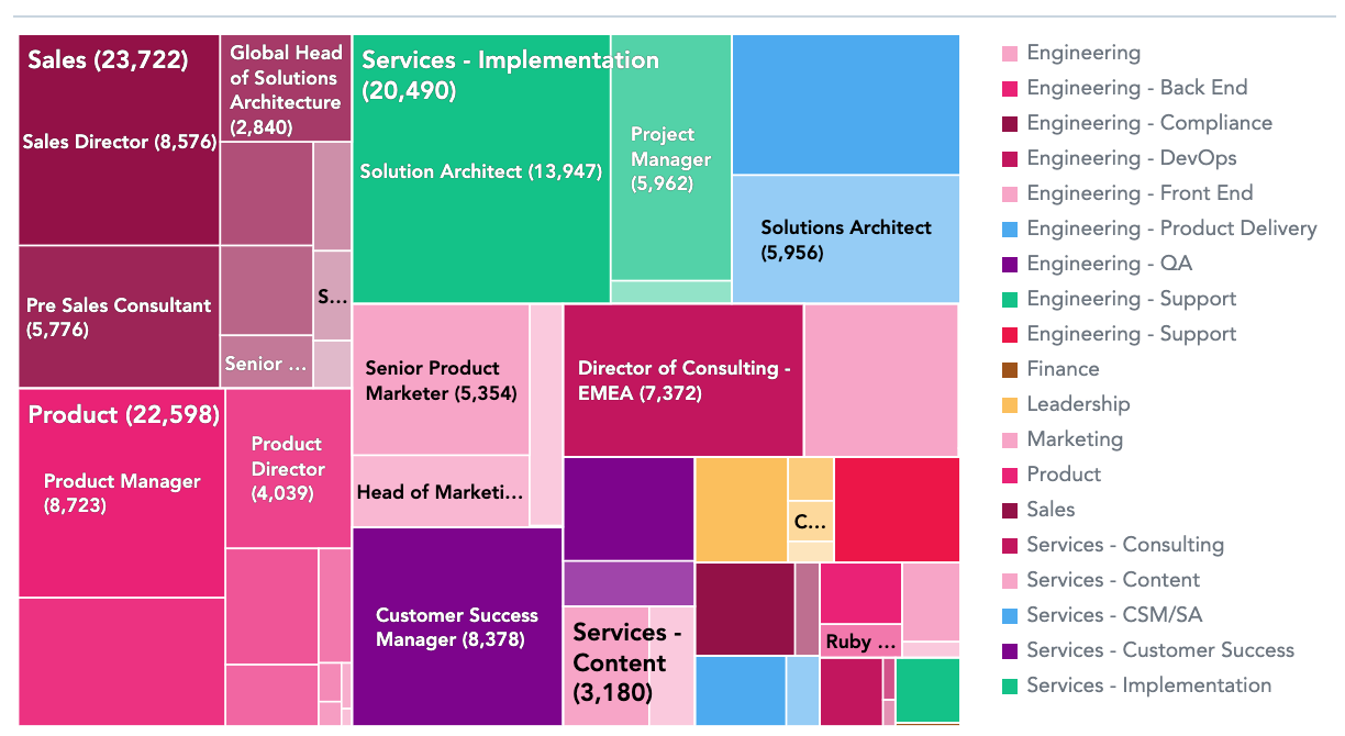
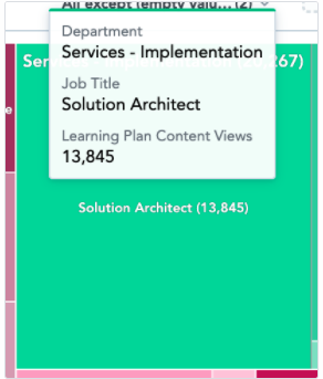
Hovering over a rectangle on the chart, reveals the number of learning plans viewed by users of a particular job title and lists the department that job title belongs to.
To recreate this example:
-
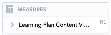
Drag Learning Plan Content Views from the Data Catalogue, into the Metrics section.
-
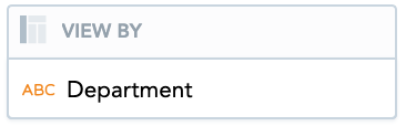
If you have a custom Department attribute, drag it from the Data Catalogue, into the View By section.
-
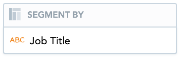
If you have a custom Job Title attribute, drag it from the Data Catalogue, into the Segment By section.
-
Drag the Department attribute from the Data Catalogue, into the Filters section above the treemap.
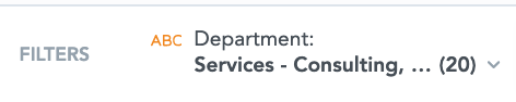
All departments will be selected by default. You can deselect particular departments if you do not want to include them on the treemap.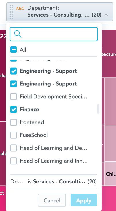
-
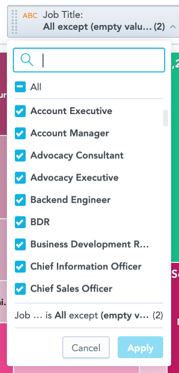
Drag the Job Title attribute from the Data Catalogue, into the Filters section above the treemap. You can deselect particular job titles if you do not want to include them on the treemap.
Additional features
The Treemap also allows you to:
Customise the look and feel
You can customise the look and feel of the chart to match your organisation's branding. For more information about customisation, see the Configuration section.