
Click the Combo chart icon to visualise your data as a combo chart. A combo chart allows you to see trends over a specific period of time and allows you to combine two different chart types (Line and Column) together in the same insight.
Example
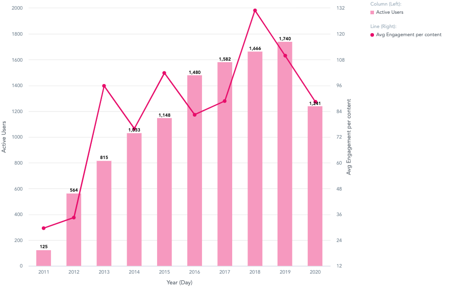
In this example, this combo chart compares the number of active users to the average engagement per content, from 2011-2020.
-
Active users are represented on a column chart.
-
Average engagement per content is represented on a line chart.
To recreate this example:
-
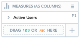
Drag Active Users into the Metrics (As Columns) section. This means that the data related to active users is displayed in a column chart.
-
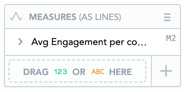
Drag Average Engagement per content into the Metrics (As Lines). This means data related to average engagement per content is displayed on a bar chart.
-
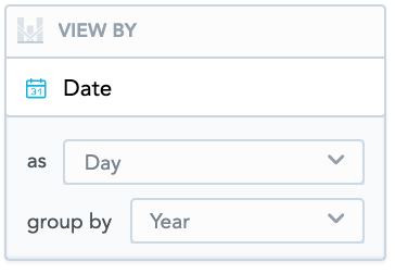
Drag Date into the View By section. From the as dropdown, select Day. From the group by dropdown, select Year. This allows you to see data for both the average views per content and the number of active users, over a specific period of time.
You can add Date or any attribute to the View by section.
Additional features
The Combo chart also allows you to:
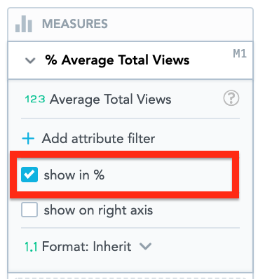
Display data as a percentage
Display the data in Metrics (As Lines) and Metrics (As Columns) as a percentage, by selecting the Show in % checkbox.
Customise the look and feel
You can customise the look and feel of the chart to match your organisation's branding. For more information about customisation, see the Configuration section.
Apply filters
You filter the data in the column chart, in the Filters section.