
Click the Column chart icon to visualise your data as a column chart. A column chart allows you to see trends over a specific period of time.

Example
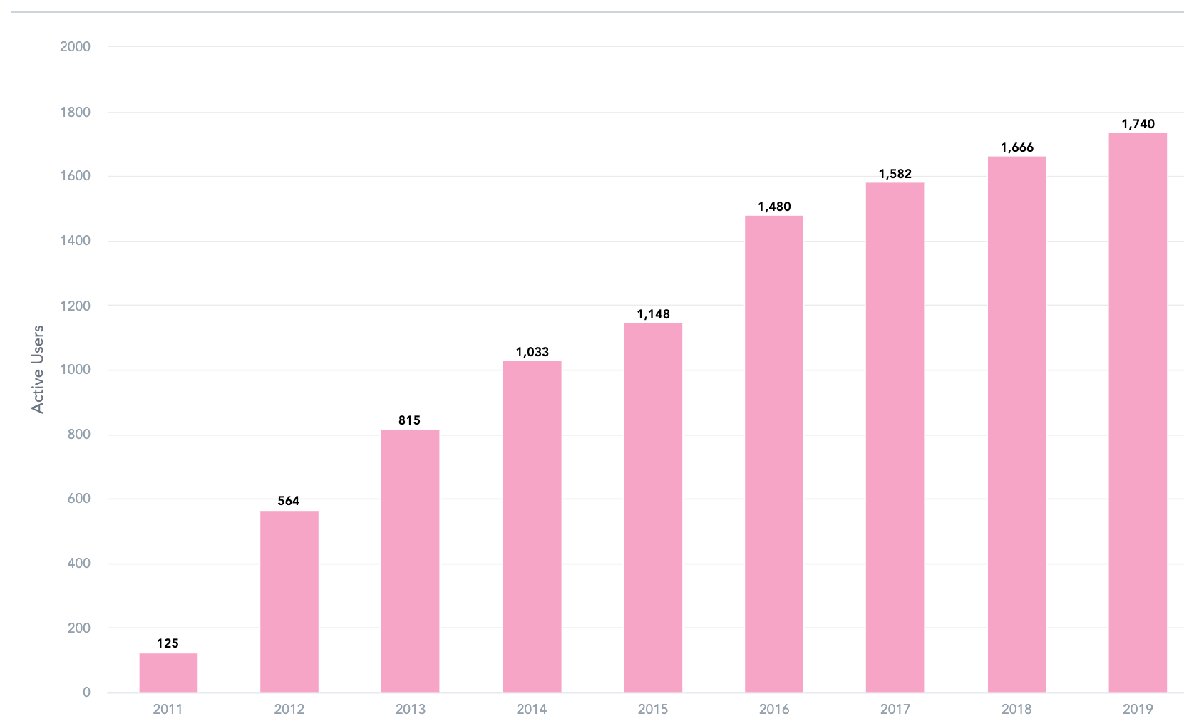
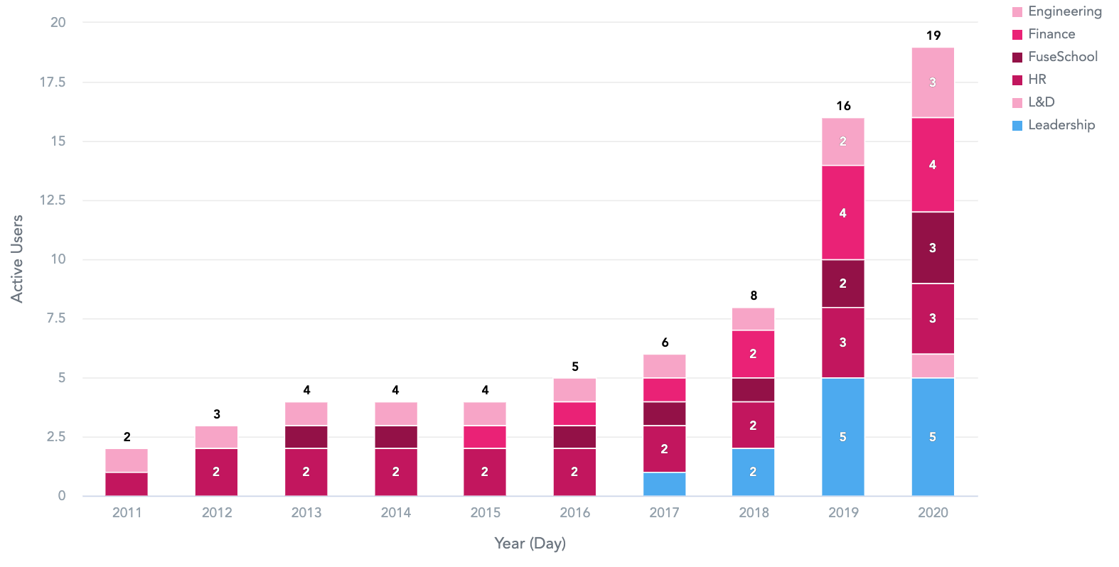
In the example below, this column chart shows the number of active users in Fuse over a 9 year period from 2011-2019.
To recreate this example:
-
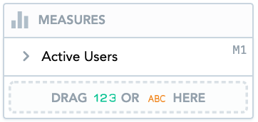
Drag Active Users from the Data Catalogue, into the Metrics section.
-
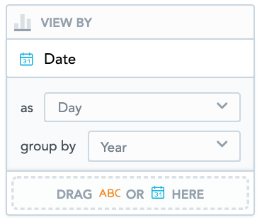
Drag Date from the Data Catalogue, into the View By section. Select Day from the as dropdown and select Year from the group by dropdown.
Additional features
The column chart also allows you to:
Create stacked column charts
You can create a stacked column chart by dragging attributes into the Stack By section. A stacked column chart can add more depth to your insight by further breaking down the data.
For example, you might want to see the number of active users in Fuse, broken down by department. To do this, you could drag the Department attribute into the Stack By section.
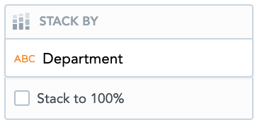
This divides each column by department. When you hover over each section, it shows the number of active users for a particular department.
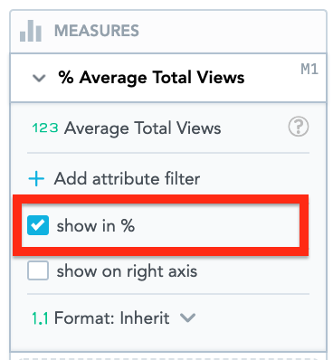
Display data as a percentage
You can display the data in the Metrics section as a percentage on the column chart, by selecting the Show in % checkbox. This can help you to understand the relative difference between the different values of the attribute (such as the different departments in Fuse).
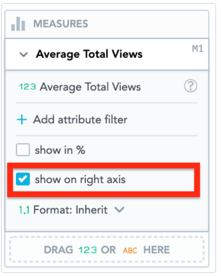
Move the Y-Axis
You can display the Y-axis to the right of the column chart, by selecting the show on right axis checkbox.
Apply filters
You filter the data in the column chart, in the Filters section.
Customise the look and feel
You can customise the look and feel of the column chart to match your organisation's branding. For more information about customisation, see the Configuration section.