If you have important training (such as mandatory compliance learning plans) that should be completed as a priority, the custom learning plan widget can be used to focus attention to that training and ensures that it stands out to your users.
Example: You might configure the custom Learning plans widget to only show specific learning plans that are of vital importance and that users must complete or set it so that certain learning plans are pinned to the start or top of the widget and are always visible and then add it to the homepage of a community so that users can see those learning plans and their current completion status and the percentage that has been completed each and every time they land on the community, serving as a reminder.
Configuring the widget
To configure the custom Learning plans widget in the Widget builder:
-
Go to the Widget builder community here.
-
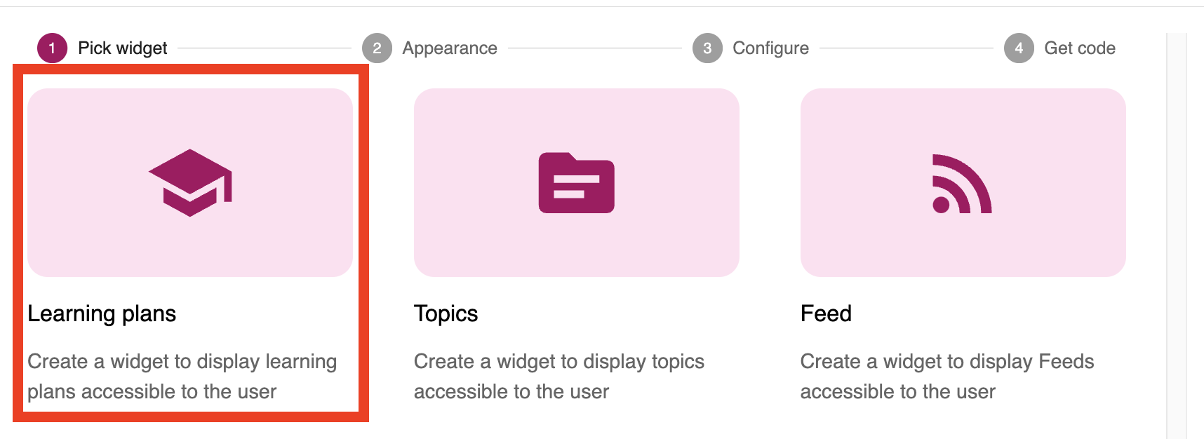
Select the Learning plans widget template.
-
In the Appearance section, configure the look and feel of the widget. You can control format, the size of the widget, cards within it, the colour scheme, and the widget title.
You can configure the following appearance settings:
-
Title: This is the title of the widget and is shown to users when viewing it. The title automatically translates into the user’s chosen language. You can also exclude words from the translation, such as brand-specific terms that you don’t want included in the widget title, using the Words to exclude field.

-
Select format: Select how you want the content to be displayed:

-
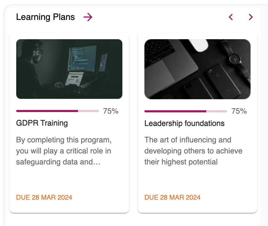
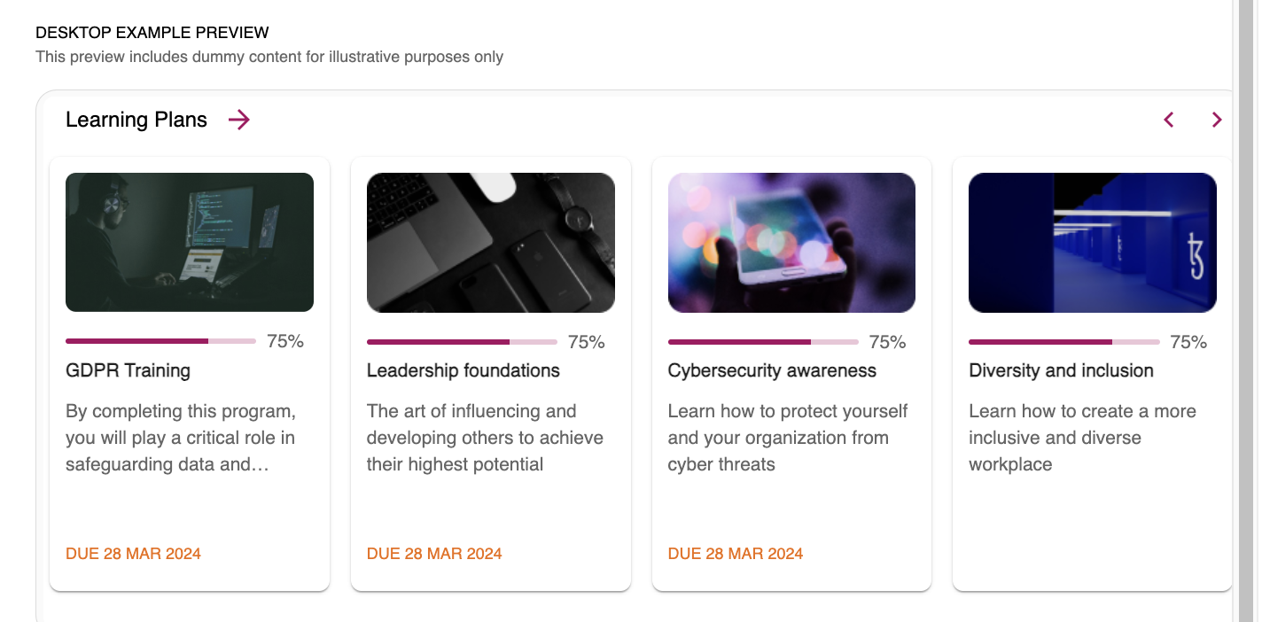
Carousel: The content is shown to users in a movable carousel of learning plan cards:
-
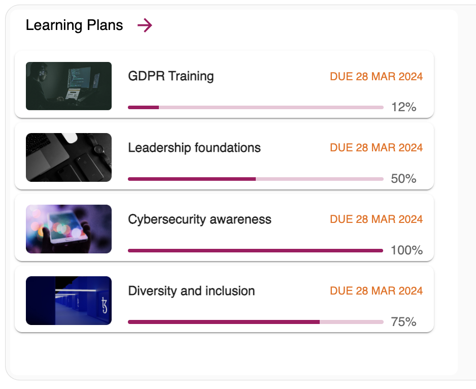
List: The content is shown to users in a static list, with each row representing a learning plan:
-
-
Select widget size: Select a preset width for your widget. You can give your widget a width of:
-
2 columns
-
3 columns
-
4 columns
-
6 columns
Note: If you have selected List above, you can only make your widget 3 columns in width.
-
-
-
Configure widget colour: Select the colour of the widget buttons and progress bars shown on the widget. You can select the primary colour that is set in your Fuse platform or manually specify a colour by entering a hexadecimal value.
To ensure that the widgets are appropriate for users with all accessibility needs, the hover state for navigation arrows will only appear if you are using certain colours, such as darker colours. This is because the hover state is a faded version of your selected colour, and if you have selected a colour that is already very bright and you hover over the arrow, the icon can become difficult to see.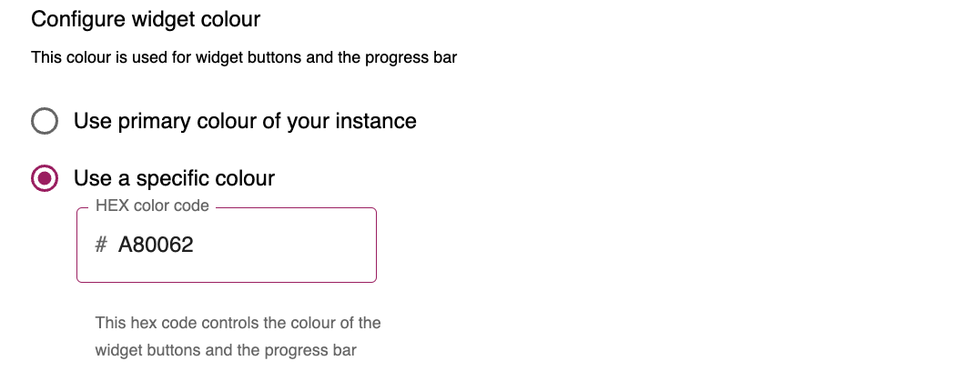
While configuring each setting, you can preview the changes using in the DESKTOP EXAMPLE PREVIEW section at the bottom of the screen:
-
When you’ve finished configuring the look and feel of the widget, click NEXT.
-
In the Configure section, you can determine what is displayed on the widget.
You can configure the following settings:-
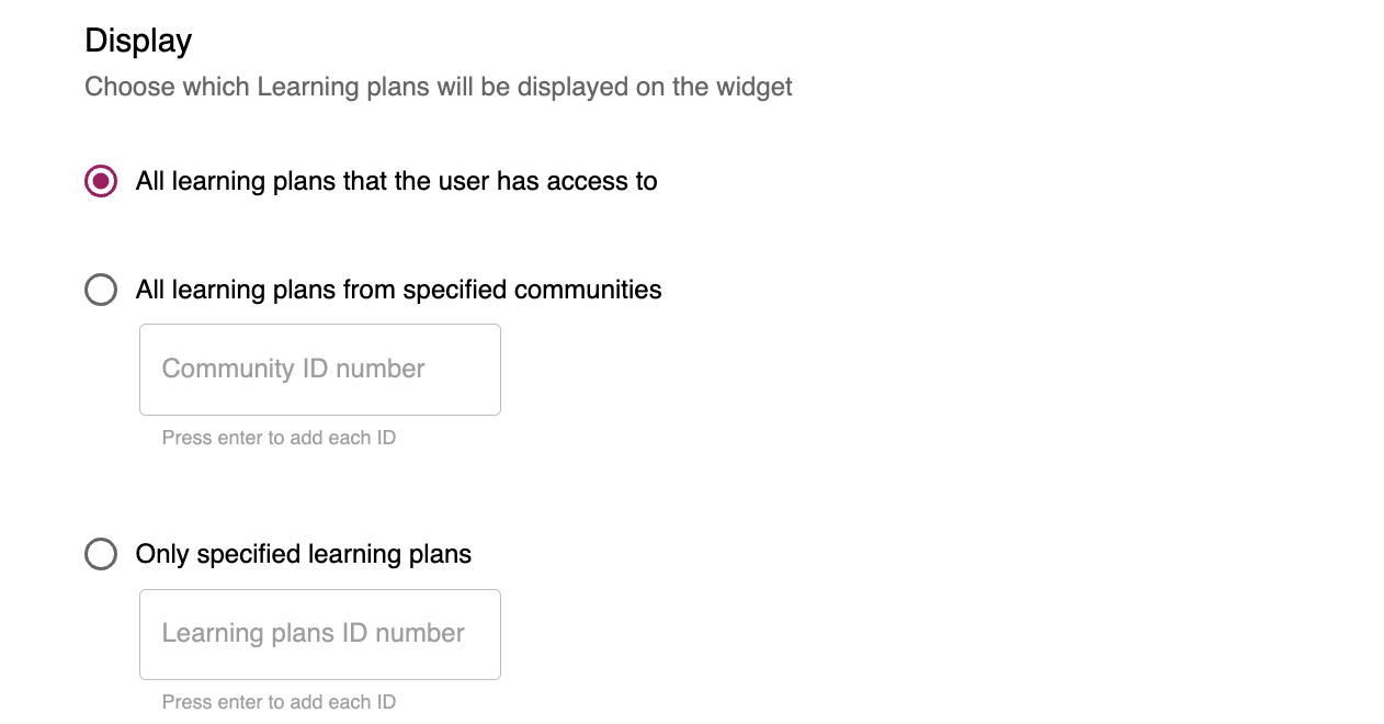
Display: Choose which learning plans will be shown on the widget to users:
-
All learning plans that the user has access to: Select this option to display all the learning plans the user has access to.
-
All learning plans from specified communities: Select this option to display all the learning plans the user has access to from a specific community. To specify the communities that the learning plans will be sourced from, enter the ID of each community in the Community ID number field and only learning plans from those communities will be shown to users.
-
Only specified learning plans: Select this option if you only want to display specific learning plans that the user has access to. To specify the learning plans, enter the ID of each learning plan you want displayed on the widget.
-
-
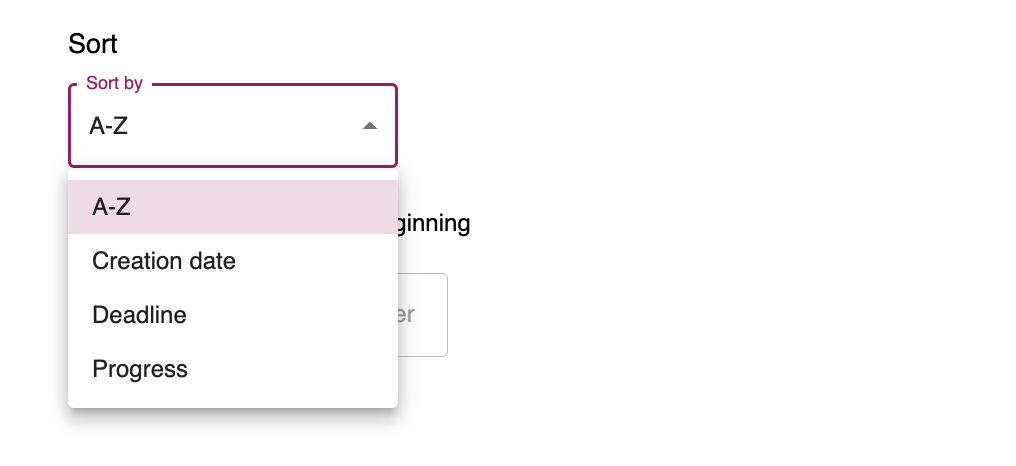
Sort: Here you can determine how the learning plans are sorted and ordered on the widget. You can sort them in alphabetical order from A-Z, by creation date, by deadline date, and by the amount of progress a user has made on each one.
-
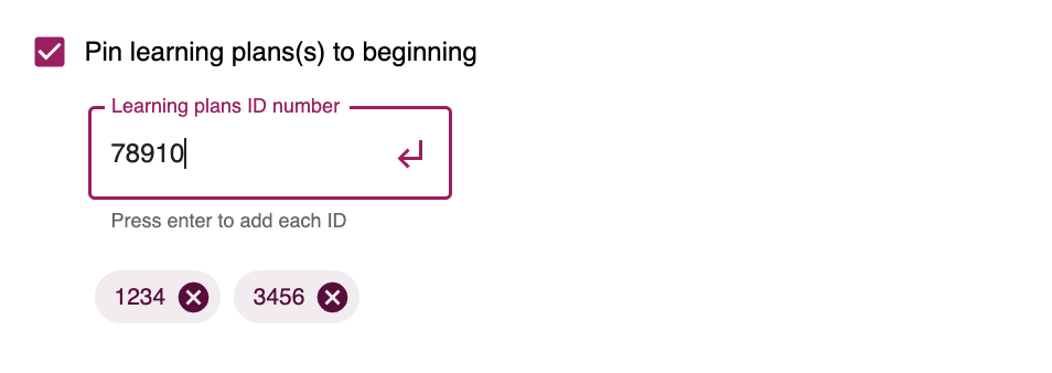
Pin learning plans(s) to beginning: You can pin particular learning plans to the widget so that they are always displayed at the start or top and remain visible. You might want to do this if they are of particular importance or urgency, and you want users to notice them to ensure they aren’t overlooked. You can do this by selecting the checkbox and then entering the IDs of the learning plans you wish to pin.
-
-
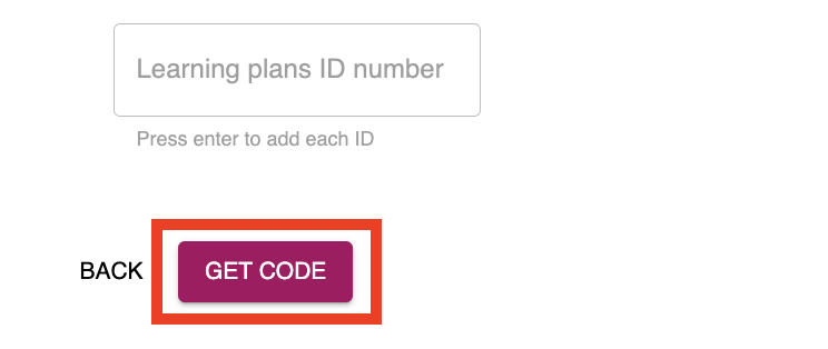
When you’ve finished configuring the display settings, click GET CODE.
-
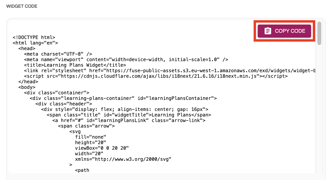
The code is then generated based on the configuration options you’ve selected. Once you are satisfied with the styling and behaviour of the widget, click COPY CODE to copy the code to your clipboard.
-
Go to Design Studio in your Fuse platform and add the Custom HTML widget to a page, ensuring that it is the same dimensions chosen in the Widget builder (e.g. if your widget in the Widget builder is set to be 3 columns wide, make sure the Custom HTML widget in Design Studio is also 3 columns wide).
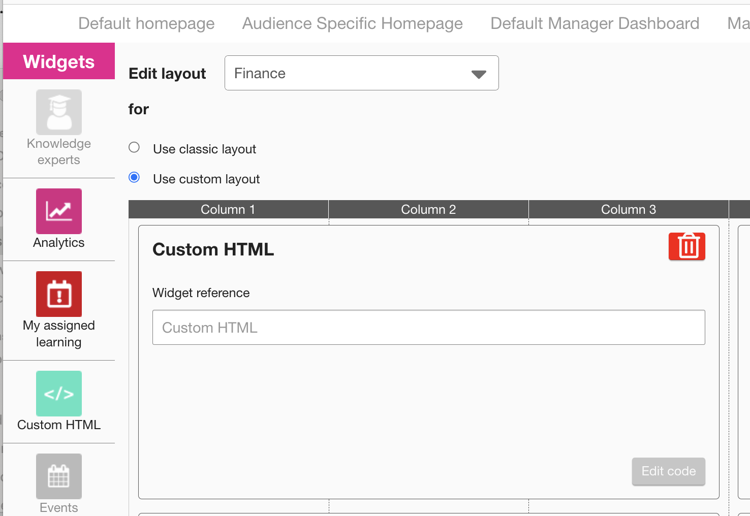
-
Paste the code into the Custom HTML widget in Design Studio, deselect the Show widget borders checkbox, then save and publish the changes. The widget then appears on the specified page with the chosen styling, content and dimensions.
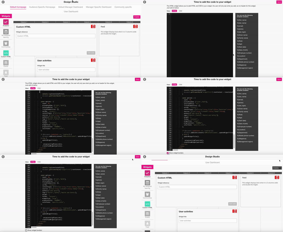
If the widget you’ve created in the Widget builder isn’t displaying as expected, please see the following FAQ: I’ve copied the code, but the widget isn’t displaying correctly. What should I do?.
